


______________
Van City Bikes & Skis is a Vancouver based company which offers mainly bike, ski and snowboard rentals but also different kind of tourism services such as Vancouver's attraction tickets and Luggage storage among others.
They were looking to a logo redesign based on the new business service: ski and snowboard rentals.
The new logo kept the essence of the old one, maintaining its elements, but turning into a more simplified, functional, versatile and adaptable logo which can be reproduce into different sizes and surfaces, something that the old one didn't have.
Van City Bikes & Skis es una compañía con sede en Vancouver, la cual ofrece principalmente alquiler de bicicletas, skis y snowboards, pero también otras clases de servicios turísticos como tiquetes para las atracciones de Vancouver y almacenamiento de equipaje entre otros. Buscaban un rediseño de su logo basado en el nuevo servicio comercial: Alquiler de ski y snowboards. El nuevo logo mantuvo la esencia del anterior, conservando sus elemetnos pero convirtiéndose en un logo más simplificado, funcional, versatil y adaptable, el cual puede ser reproducido en diferentes tamaños y superficies, algo que el anterior no tenía.
______________

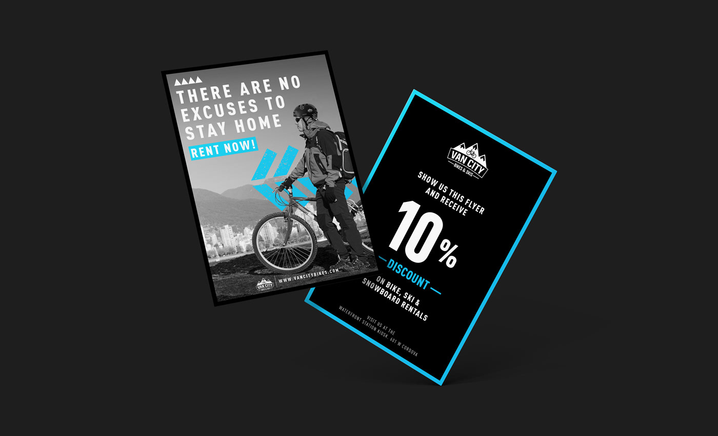
GRAPHIC ELEMENTS
The old brand didn’t have a defined graphic communication, so for the new logo it developed a graphic language with elements related to the city of Vancouver and with the company’s services, giving the new brand an unity, a voice and an identity.
La marca anterior no tenía una comunicación gráfica definida, por lo que con el nuevo logo se desarrolló un lenguaje gráfico con elementos relacionados a la ciudad de Vancouver y con los servicios de la compañía, dando así a la nueva marca una unidad, una voz y una identidad.


___
THANKS!
Client: Van City Bikes & Skis
Concept, Art Direction & Graphic Design: Daniel Alford
Agency: Freelance Project
___


